The AFL Match Centre drives a lot of traffic for passionate AFL fans who want to follow along with the game however it was outdated and non-responsive.
The Match Centre product required a major overhaul as the design and technology were severely outdated, making critical changes impossible. The gains from making incremental changes were minuscule or nonexistent.
The new responsive design would allow us to add in components that were already responsively built (articles, video) and make it more commercial viable. We were also able to incorporate analytics into the new Match Centre to give us greater insights into the fans behaviour.
Client
Australian Football League (AFL)
Date
2018
Programs & tools
Whiteboard Sketch Principle Zeplin
INVOLVEMENT
Research Wireframing (whiteboard) Competitor Analysis UI Design / Visuals User Testing Design Reviews
A BIT OF CONTEXT
The old homepage was outdated and non-responsive
The AFL website (afl.com.au) is seen by millions of fans. The old site consisted of seperate desktop and mobile sites. It was cluttered, slow and not consistent across platforms or devices. The visual design was outdated and inconsistent with the AFL app.
Circa 2018 – Screenshot of old Homepage
m-SITE:
HOMEPAGE 2018
The Goals
Reduce perceived page complexity and clutter
Better functionality that allows fans to filter and find relevant content
Better surfacing of the varying content types housed within the site
Improve page load time
Allow fans to easily see the latest content that has been published to the site
Better integration of premium content(particularly on game day)
Better promotion of AFL Products(Fantasy, Tipping, MOTY & GOTY etc)
The Process
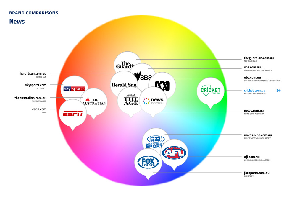
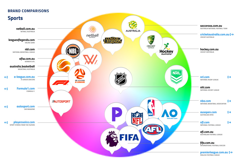
Brand Comparison
Research & Competitor Analysis
Team & My Role
The AFL development team (engineers, front-end, back-end, QA) are split into two scrum teams and work in 2 week agile sprints.
My role included working closely with the Head of Product & Development, Product Managers and Front-end & Back-end Development teams to ensure deliverables including interface designs, prototypes, user testing and handover were delivered according the product roadmap.
At each stage of development I did design reviews with the developers and check-ins with QA to ensure consistency of the UI elements.
The Process
Design Process
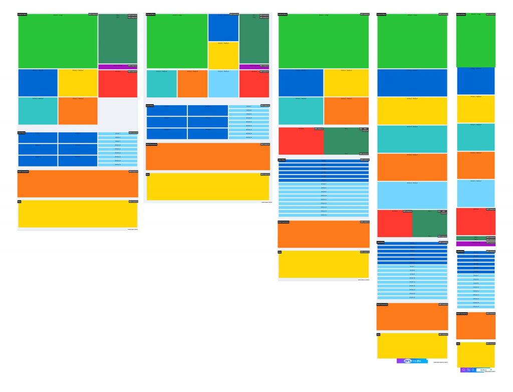
My design process involved taking the wireframes from the Head of Product & Development (Wayne Vickers) and designing the interface to work across all platforms. This involved designs for the different breakpoints including desktop, tablet and mobile.
By using the atomic methodology approach of atoms, molecules and organisms I was able to build components. The developers would be assigned components and to make it easy as possible I put the components at the different breakpoints on one page. This way they could see the component they were working on, but also how it compared to the other components across devices.
Wireframes by Wayne Vickers (Head of Product & Development) https://au.linkedin.com/in/waynevickers
Concepts
Initial concepts
Technical Requirements / Features
CSS GRID
The developers implemented the new responsive layout via css grid. Although css grid had been around for a few years, it wasn’t supported by all browsers. We have millions of visitors and need to accommodate them to our best ability. Before front-end design began we needed to make sure that content was ordering correct across the different breakpoints. Simon (Front-End) developed the css grid initially with some bold colours and text we were able to easily see the blocks of content.
CSS GRID
Final Results
News / Video
The current homepage served us well, but it’s time for change. We’re looking to provide a faster, simpler, more engaging experience for you. One where you can find what you need faster, on all your favourite devices.
Find the news you want more easily
No more waiting/clicking through the carousel to see the key news headlines. Now you can scan through the most important updates at a glance and jump straight in. Our new content strips will soon include topic tags allowing you to quickly check for favourite topics and also let you ‘show more’ of what you want, right there on the homepage.
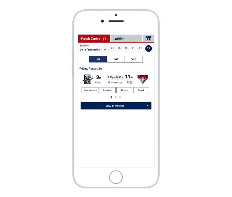
Find the match info and details quickly
We’re upgrading the right-hand side Gamebar too. Like everything in the new homepage it will now be available on all devices. It will continue to be your weekly entry point to all things match-related, with live scores plus quick links for tickets and broadcast info, but will now also give you convenient access to the AFL ladder and other key season info.
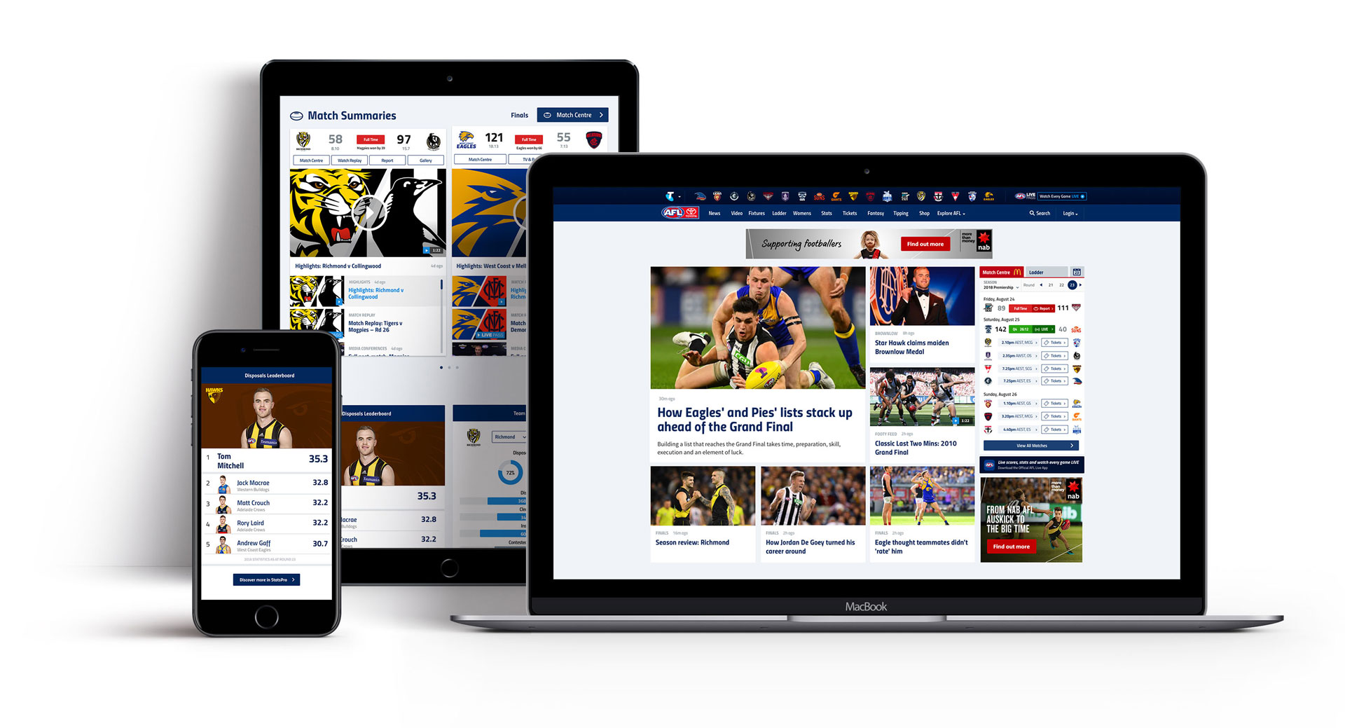
Watch the highlights and best match videos in one place
Our new Match Summaries strip houses all the key news and videos for every match each week (take a peek at our new video page if you haven’t already seen it…).
Get all the stats that matter
We’re stepping up when it comes to stats, too. The new Stats area includes some of the great StatsPro content including player profiles, team match-ups and stats leaderboards.
Notifying the User
We wrote an article detailing the changes that were coming to the AFL Homepage. The week before we launched the homepage we turned on notifications to let them know about the changes. We kept this on when we launched so that user could find out about why we made the changes.