Overview
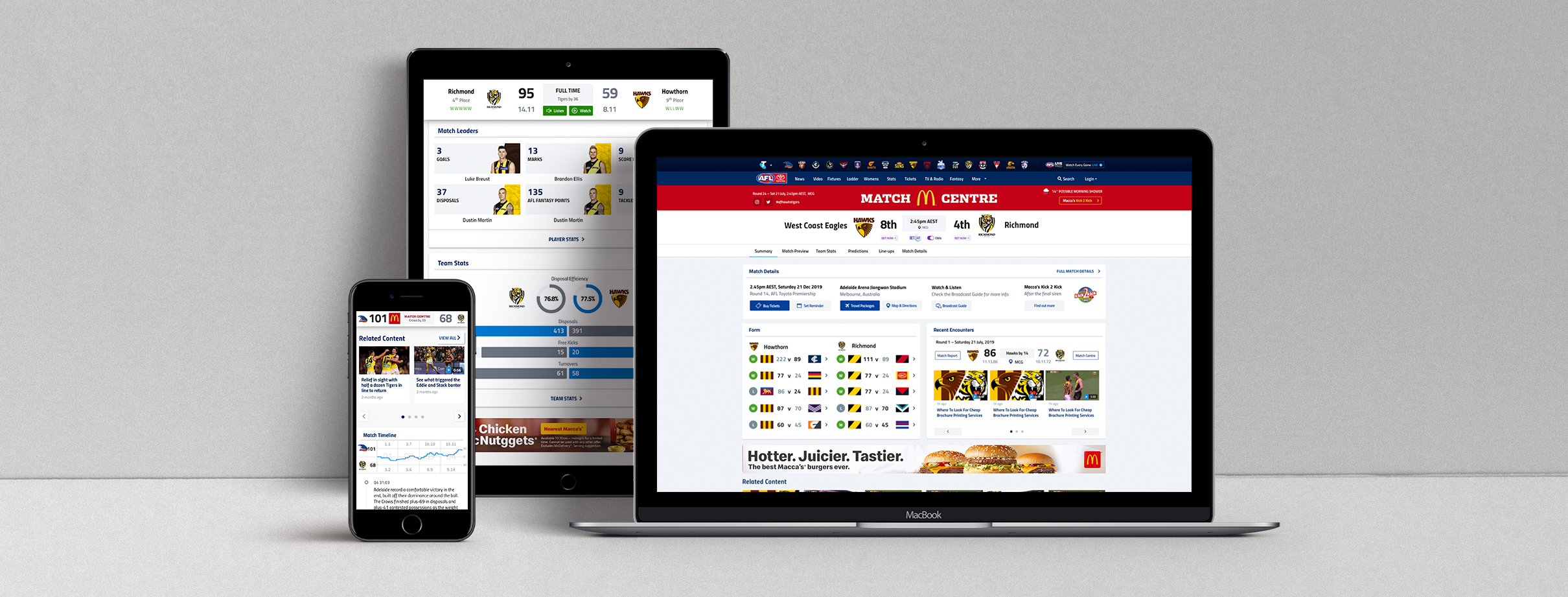
The AFL Match Centre drives a lot of traffic for passionate AFL fans who want to follow along with the game however it was outdated and non-responsive.
The Match Centre product required a major overhaul as the design and technology were severely outdated, making critical changes impossible. The gains from making incremental changes were minuscule or nonexistent.
The new responsive design would allow us to add in components that were already responsively built (articles, video) and make it more commercial viable. We were also able to incorporate analytics into the new Match Centre to give us greater insights into the fans behaviour.
Client
Australian Football League (AFL)
Date
2019
Programs & tools
Whiteboard
Sketch
Principle
Zeplin
INVOLVEMENT
Research
Wireframing (whiteboard)
Competitor Analysis
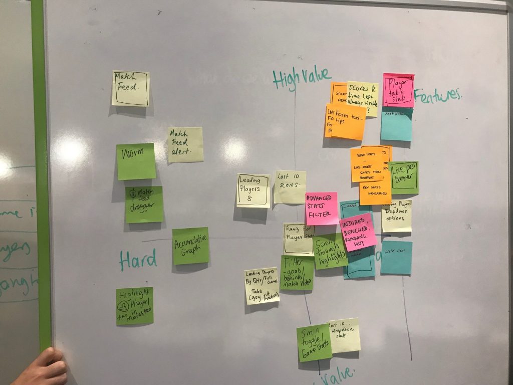
Feature Matrix
UI Design / Visuals
User Testing
Design Reviews
A BIT OF CONTEXT
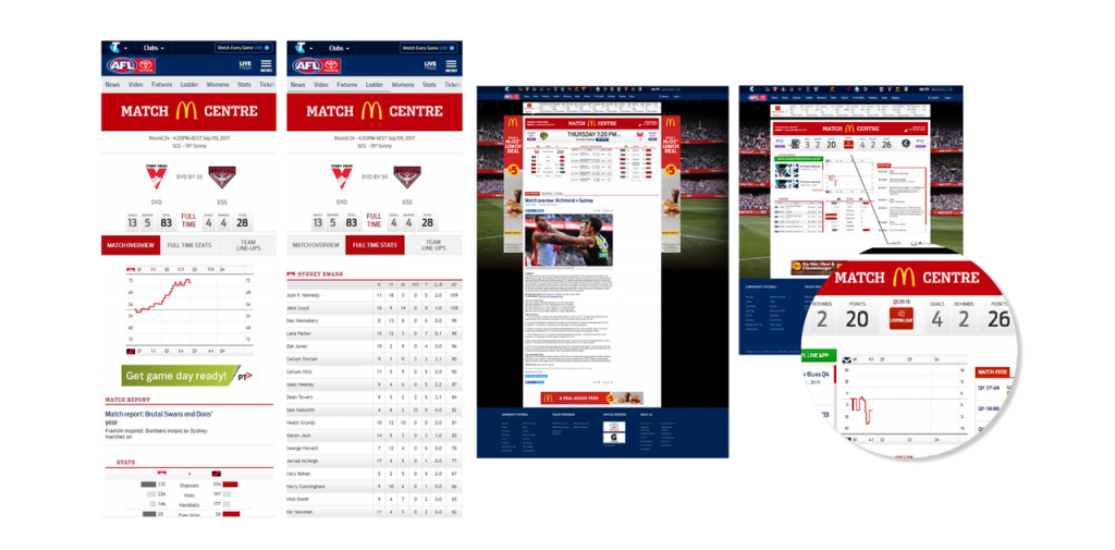
The old Match Centre was outdated and non-responsive
The Match Centre product required a major overhaul as the design and technology were severely outdated, making critical changes impossible. The gains from making incremental changes were minuscule or nonexistent. The new responsive design would allow us to add in components that were already responsively built and make it more commercial viable. We were also able to incorporate analytics into the new Match Centre to give us greater insights into the fans behaviour.
Goals
We were tasked to redesign and develop a responsive AFL Match Centre to makes it easier for fans to follow AFL matches by rolling out an improved match experience following on any device.
We need to create a fast, efficient, intuitive Match Centre experience that is easy to use and ensuring fans had access to the information they wanted at the right time.
We needed to align with the AFL App in order to give a consistent experience for fans across platforms. This involved working closely with the AFL App designer and other stakeholders.
The Process
Research & Competitor Analysis
The AFL has retained its standing as the fourth-best attended sporting competition in the world.
Competitors
Premier League
NBA
ESPN
A-League


Team & My Role
The AFL development team (engineers, front-end, back-end, QA) are split into two scrum teams and work in 2 week agile sprints.
My role included working closely with the Head of Product & Development, Product Managers and Front-end & Back-end Development teams to ensure deliverables including interface designs, prototypes, user testing and handover were delivered according the product roadmap.
At each stage of development I did design reviews with the developers and check-ins with QA to ensure consistency of the UI elements.
The Process
Design Process
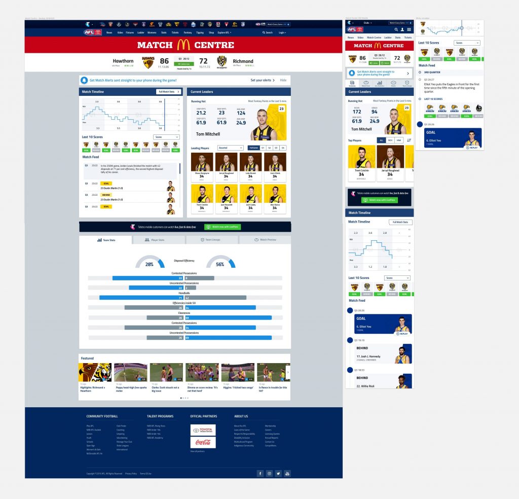
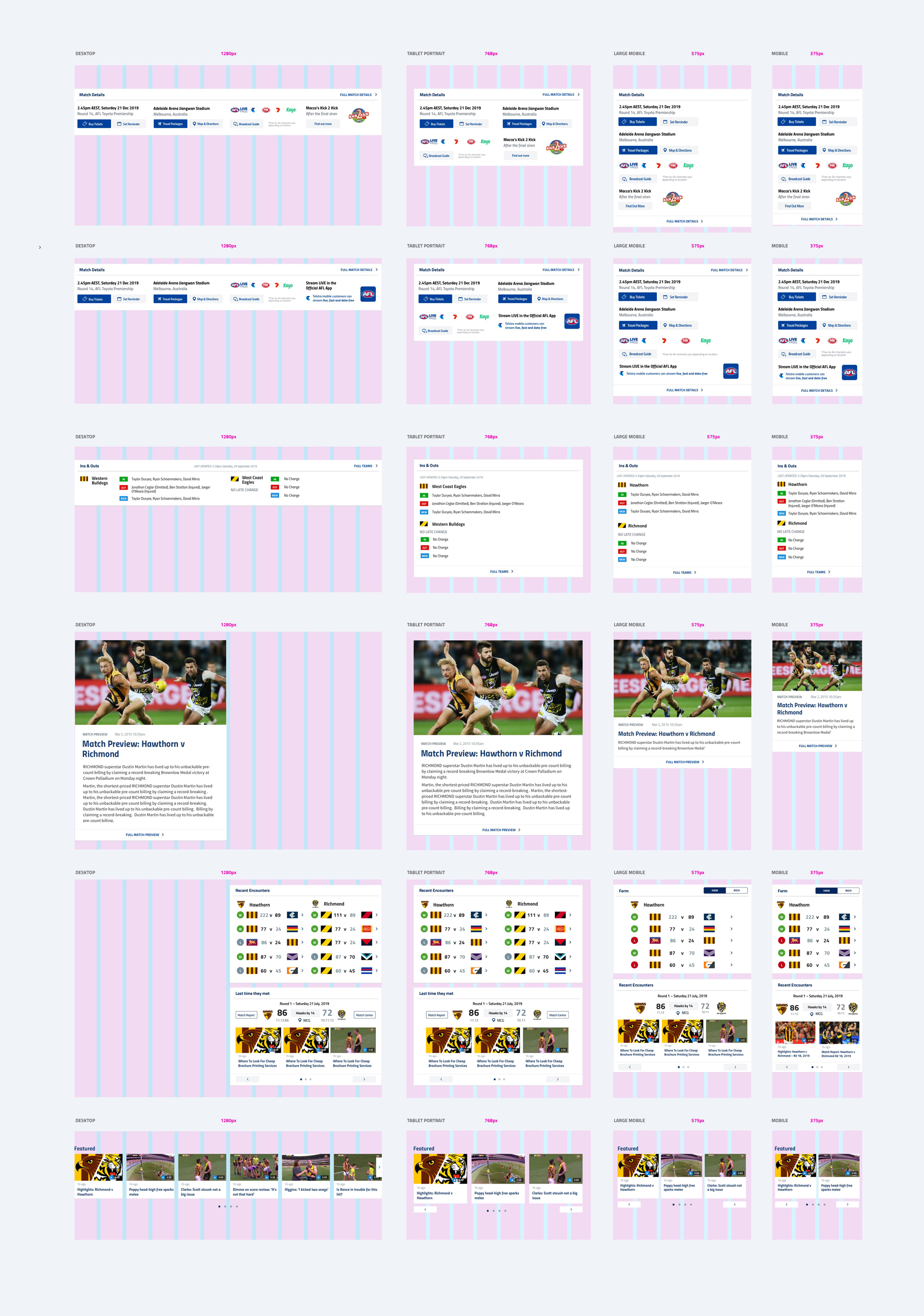
My design process involved taking the wireframes from the Head of Product & Development (Wayne Vickers) and designing the interface to work across all platforms. This involved designs for the different breakpoints including desktop, tablet and mobile.
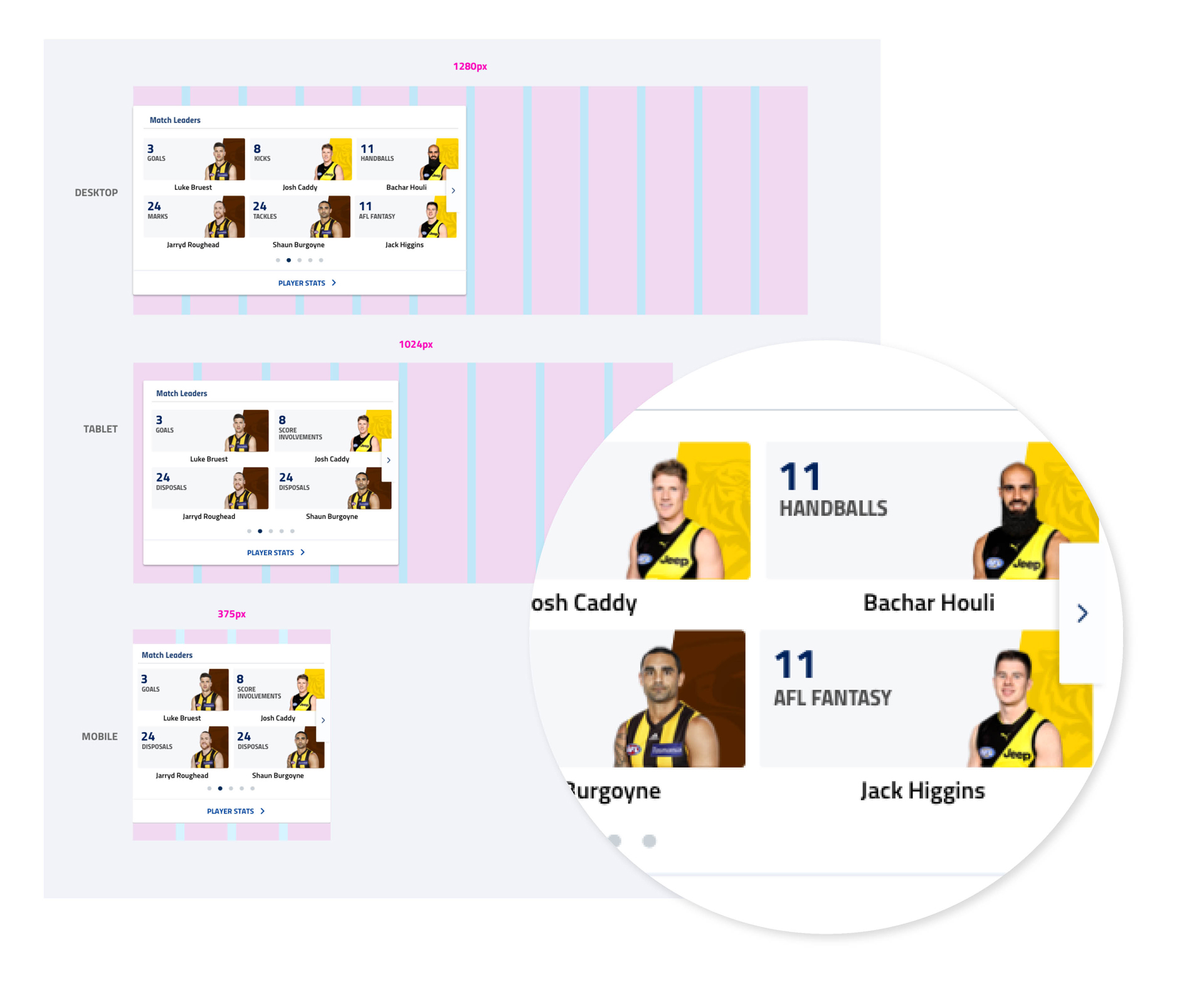
By using the atomic methodology approach of atoms, molecules and organisms I was able to build components. The developers would be assigned components and to make it easy as possible I put the components at the different breakpoints on one page. This way they could see the component they were working on, but also how it compared to the other components across devices.
Concepts
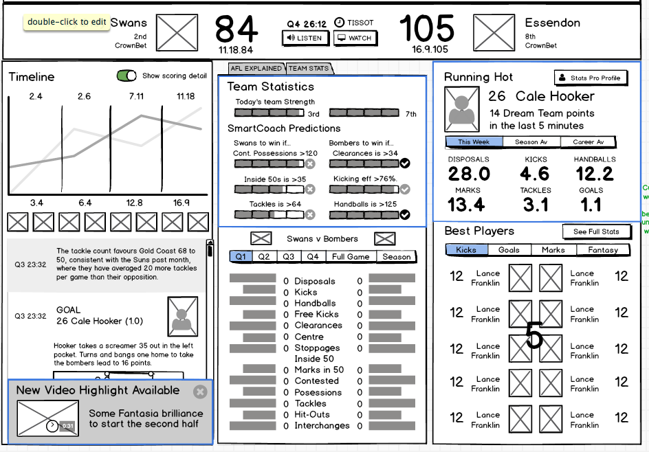
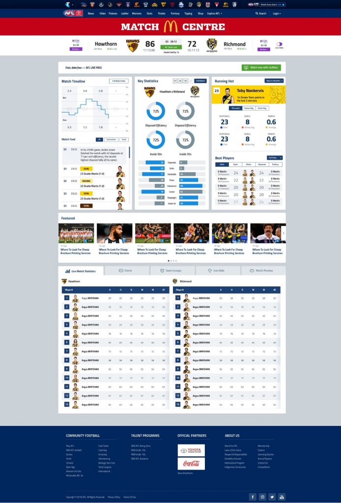
We explored multiple concepts with 2 & 3 columns, along with the running hot leader.
Technical Requirements / Features
SPRINTS & DESIGN REVIEWS
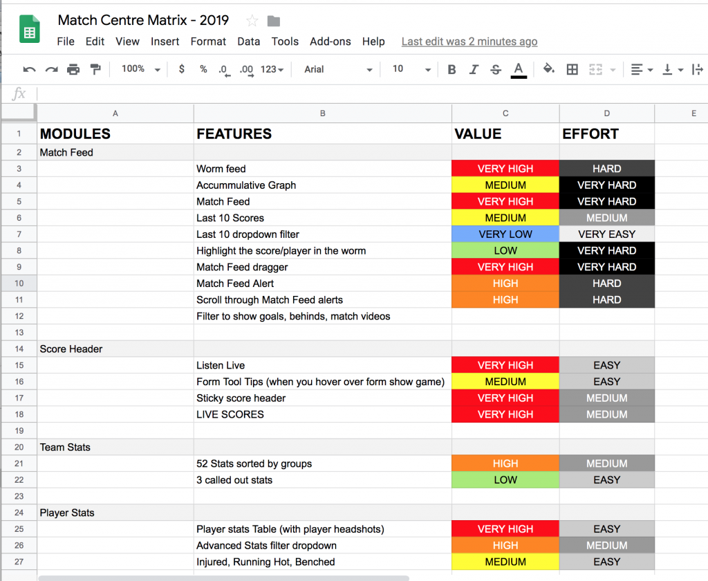
Working with the Head of Product, Product Manager and development team we created a feature matrix to determine which features would be included. It was important to include all the developers in this workshop so as to correctly estimate difficulty and for them to understand the business value.
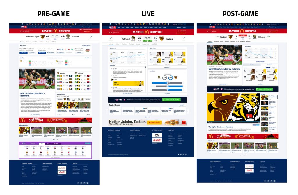
The Match Centre has three states of the game: Pre-game, LIVE, Post-game and the the fans have different needs depending on the state of the match.
Business Requirements
COMMERCIALISATION & SPONSOR INTEGRATION
We need to ensure high-value sponsor and banner integration for McDonalds without impacting the fans experience. McDonalds also sponsor the Macca’s Kick 2 Kick and so we needed to promote to fans that they are able to have a kick on the field after the siren after certain games.
TICKETS & PACKAGES
We needed to make it easy for fans to buy tickets and travel packages.
PREMIUM WATCH – LIVE PASS
Telstra have the media rights for live streaming the game on mobile, and we needed to promote the AFL Live Pass to watch the game live through the AFL App (Free for Telstra mobile customers).
User Testing
We conducted qualitative user testing using high-fidelity desktop and mobile prototypes with 5 users to observe actual users to carrying out some realistic tasks. We gaining critical feedback and a better understanding pain points and what features were important. A part-time UX designer wrote the user-scripts and I created high-fidelity mobile prototypes in Principle and desktop in Invision. We revised the designs and conducted another round of user testing with 5 different users to validate.
Revisions
We simplified the Summary page by including a snapshot of the Match Feed which users could click through the Full Match Timeline. We also created a scroll nav so that users could quickly and easily navigate the section they were interested in.
We initially also had just ‘Stats’ as a tab where users would then be able to select ‘Team stats’ or Player Stats. During user testing the fans told us they wanted quick access to player stats first and foremost and preferred less clicks.
Final Results
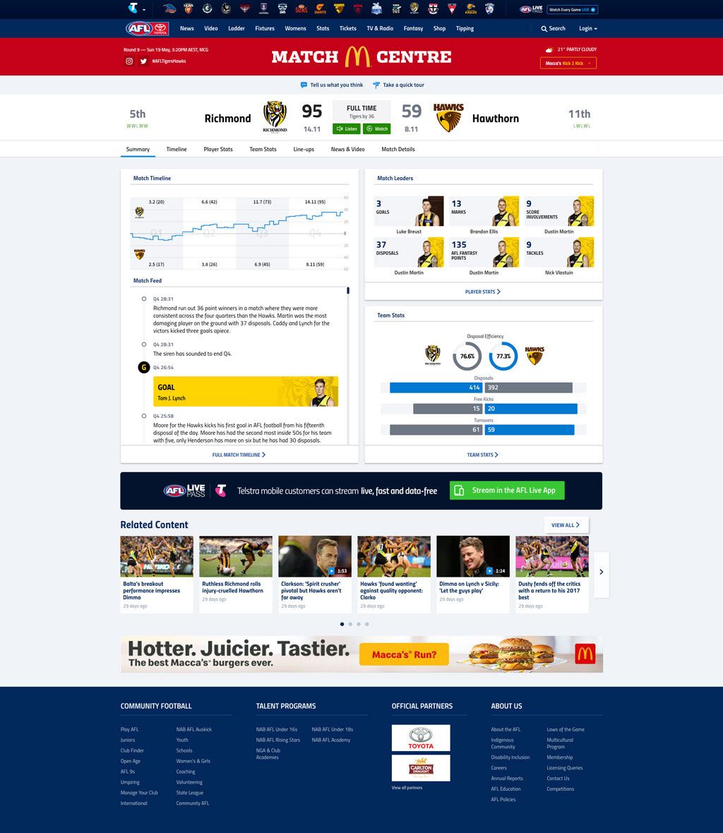
Live State
The launch of the new Match Centre was staggered beginning with LIVE state (game in progress).
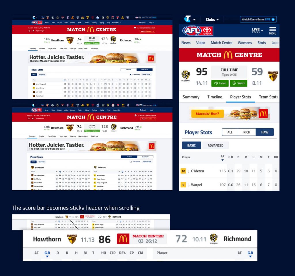
Improved scoreboard and navigation
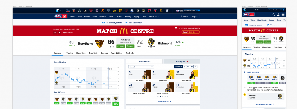
Now in one place you can view current scores, the match clock, broadcast information and find how to watch the match live. Below the scoreboard we’ve added a new row of options, making it easier to find what you’re looking for.
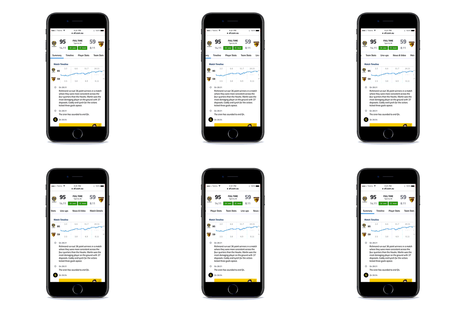
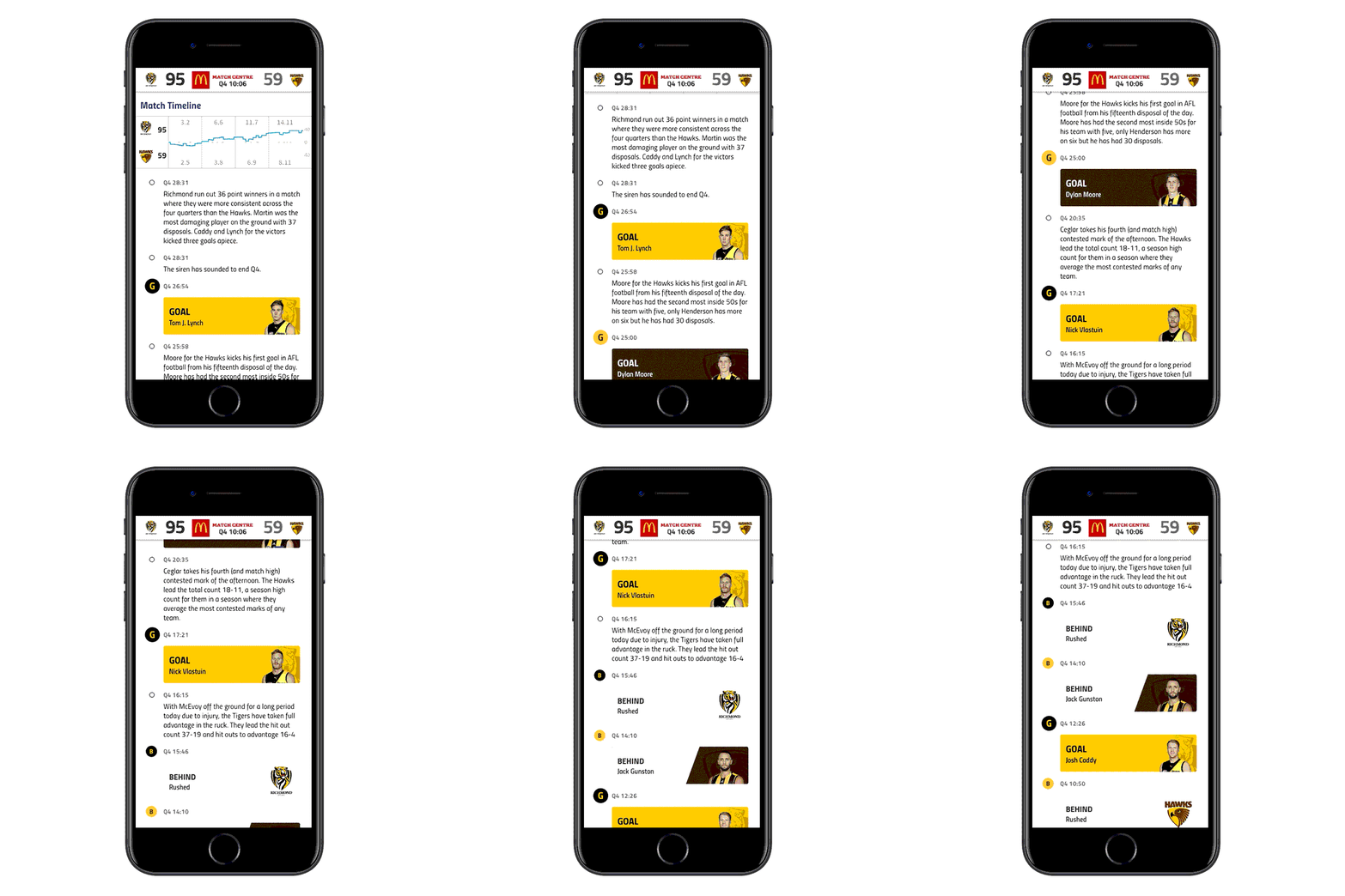
Match Timeline and Commentary
Find a more in-depth timeline and insights here. The score strip stays in place on smaller devices, so you won’t lose track of score changes while you’re catching up on the action.
Player and Team Stats
More stats are now available – especially in the team stats section, and the stats are much easier to view on all devices.
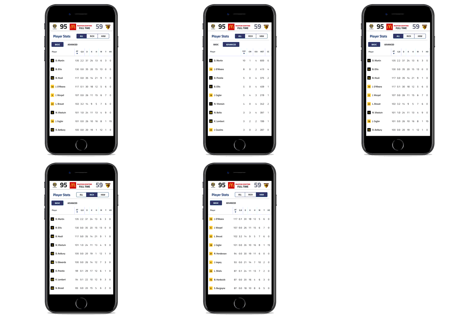
Player Stats
From our analysis we noticed users were accessing the ‘By Players’ view the most. Fan feedback also suggested this with request for more stats. For the finals we’ll launch with almost double the amount of stats to be available to users
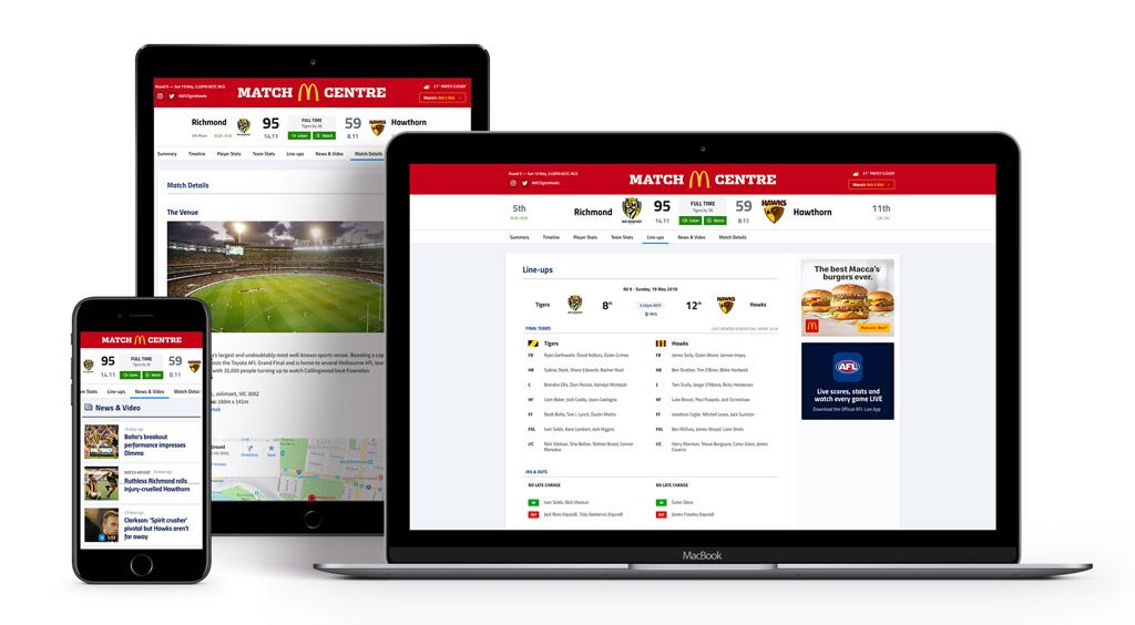
Pregame
Line-ups
It’s now easier to view the team line-ups, and additional views are on the way.
News and Video
All content related to the match can be found here, from in-game video highlights to match previews, injury news and reports.
Match Details
A new section with all the info you need about how to watch the game, the venue, and how to get to the ground.
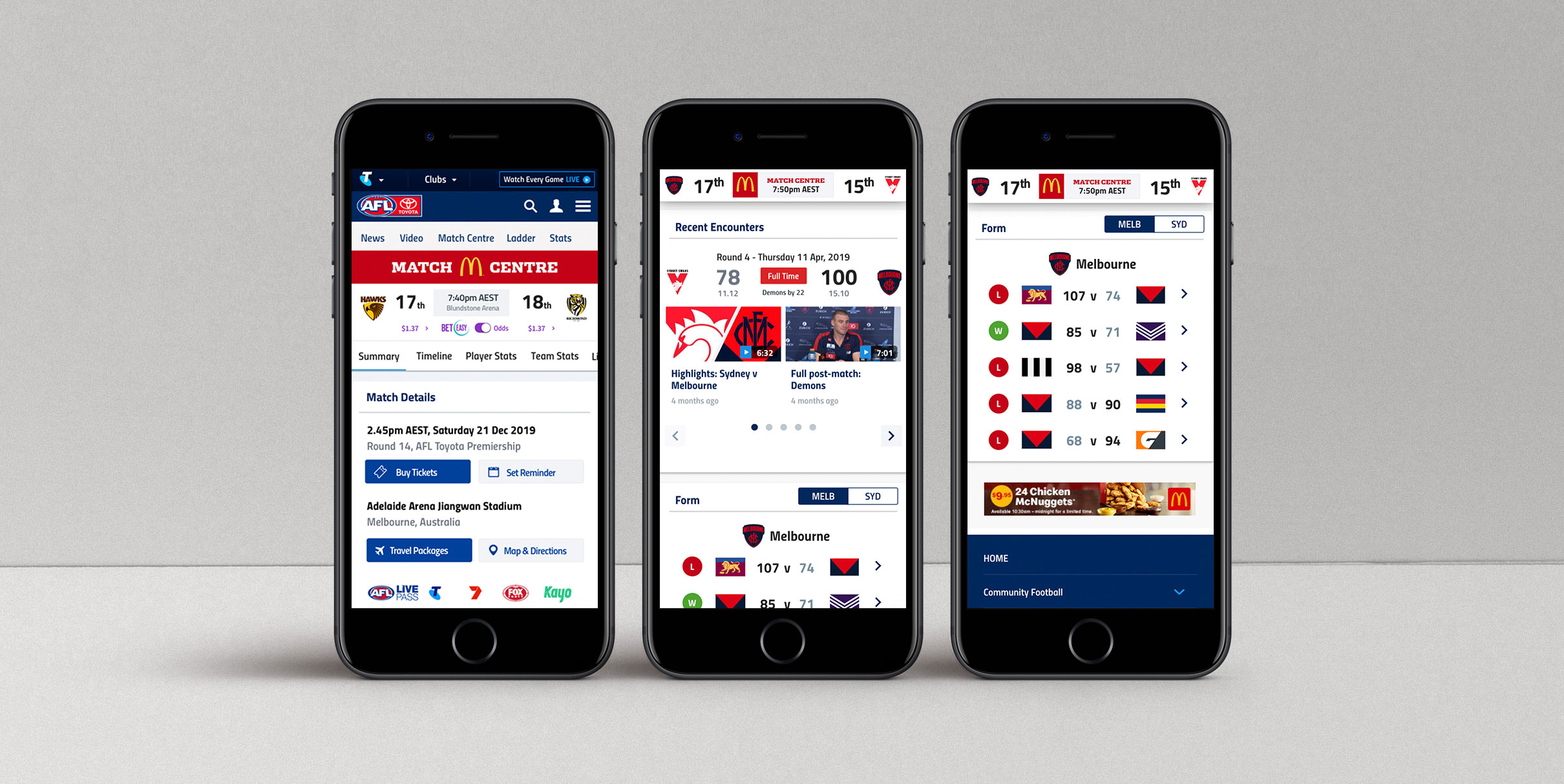
Post game
Key Features:
– Match Report
– Highlights & Replay
– Timeline worm
– Match Leaders
– Player Stats
– Team Stats
– News & Video
– Match Details

Informing users about the upcoming change via an article & notifications
To help our fans know what was coming we put together an article about the soon to be released new Match Centre which was posted a week before we launched. We wanted to be transparent and help them

Fan Feedback & Iterations
Encourage Fan Feedback
We wanted to encourage fan feedback over the first few weeks after the release of the new Match Centre.
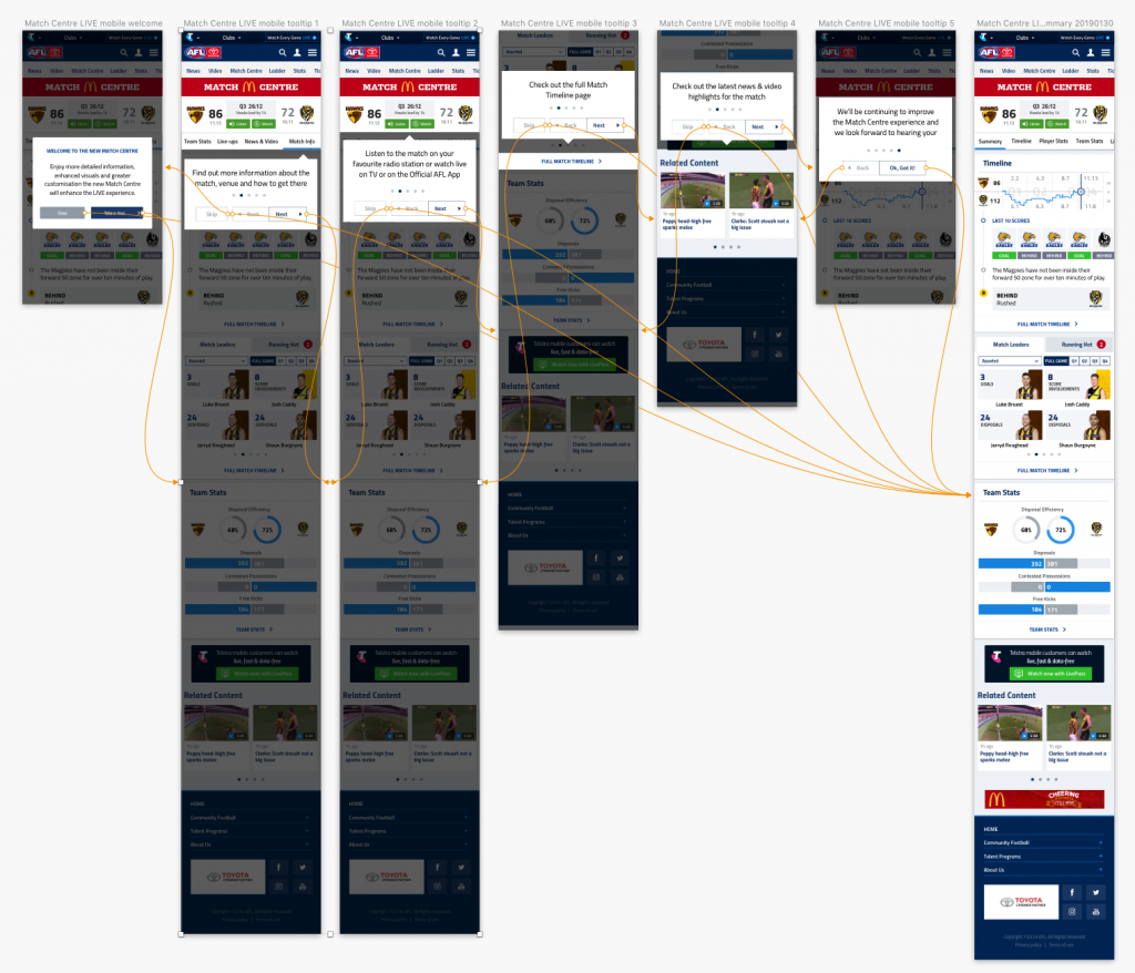
Tooltips
We created tooltips for the users first time so that they could familiarise themselves with the new product
