We are continually looking at ways to deliver content for a wider range of fans and bring more life in to the visual designs of afl.com.au
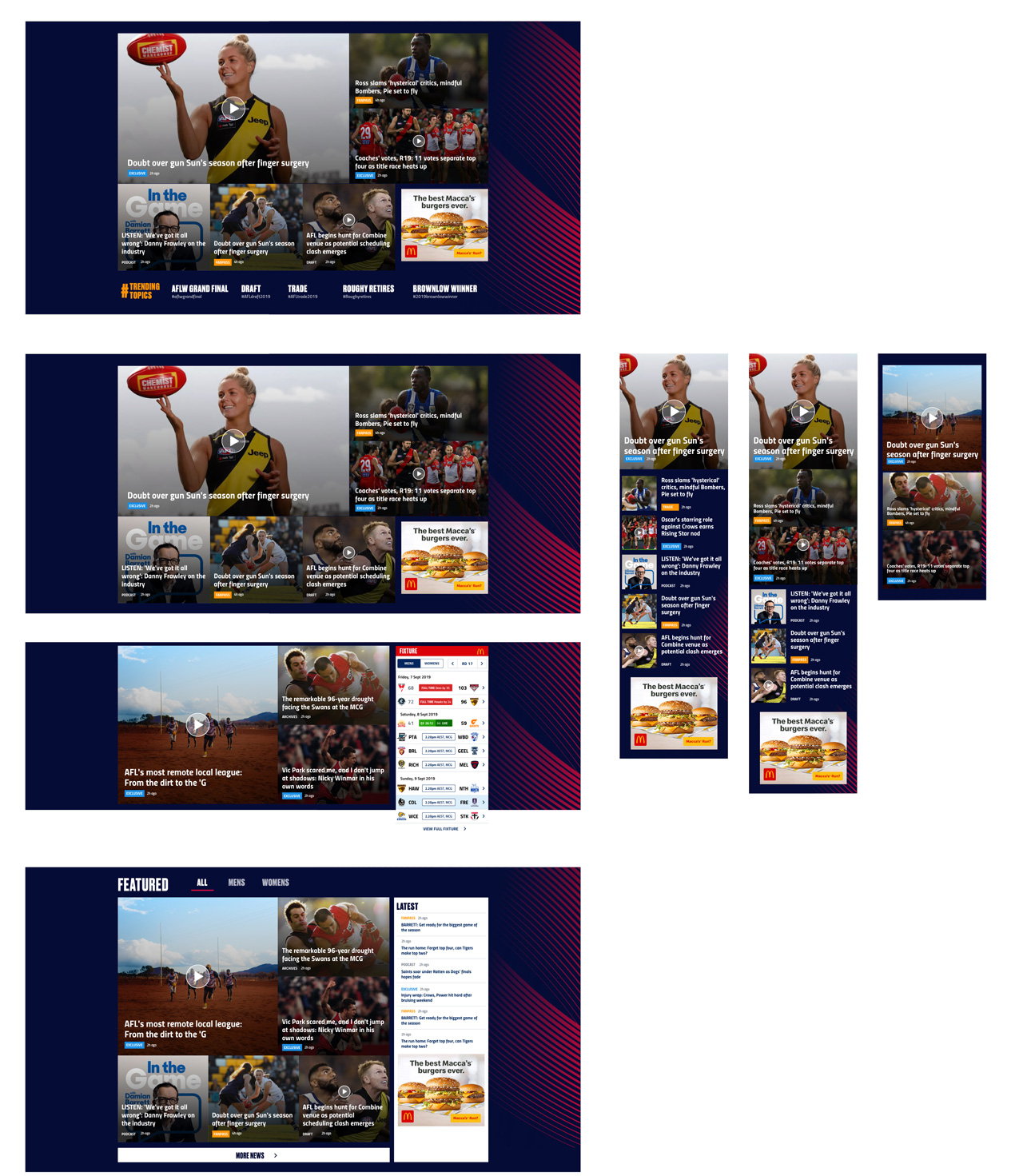
The concepts are based around having less news content on the homepage (and directing the fanatic fans over to news.afl) and thus being able to utilise the homepage for newer fans and those that know less about AFL as a game.
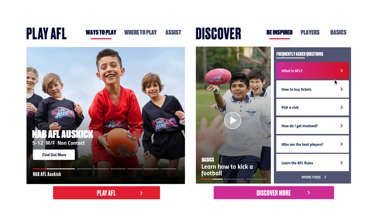
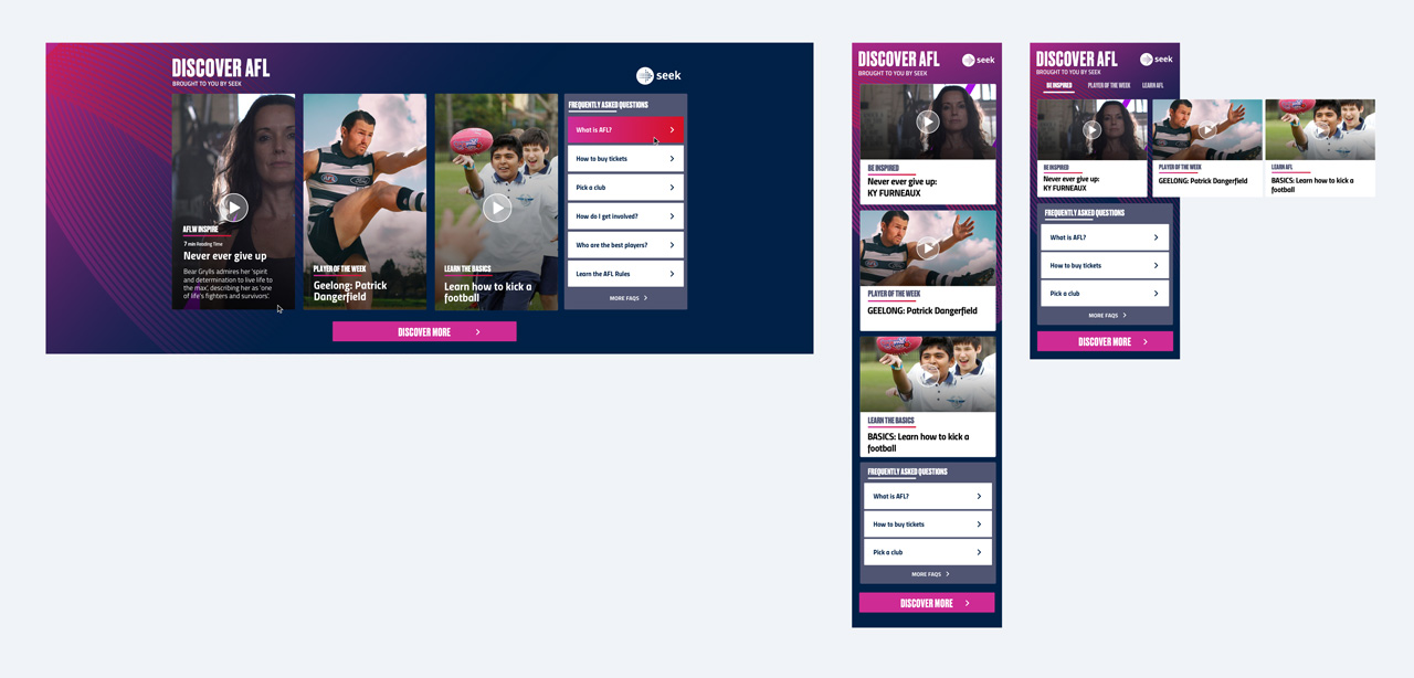
We developed new modules to house longer form content/video and also ways to promote our new YouTube content. Other new modules include a discover and play section to help onboard.
Australian Football League (AFL)
2019
Whiteboard
Sketch
Principle
Zeplin
Research
Wireframing (whiteboard)
Competitor Analysis
UI Design / Visuals
User Testing
Design Reviews
Please read the case study for the previous case study to see how we got to this stage
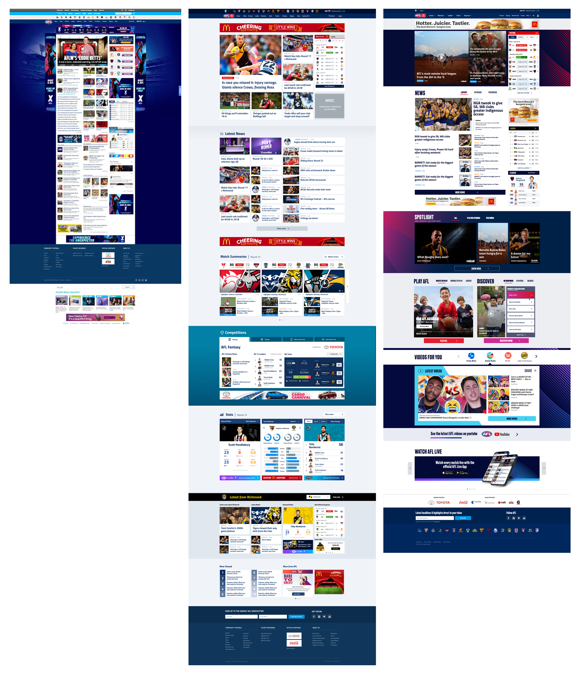
My design process involved taking the wireframes from the Head of Product & Development (Wayne Vickers) and designing the interface to work across all platforms. This involved designs for the different breakpoints including desktop, tablet and mobile.
The UX Team (Wayne Vickers, Lisa Von Fersen and myself worked from sketching up wireframes on the whiteboard, to translating these to low-fidelity designs right through to high fidelity
Lisa and I explored multiple layout options for the page and modules to ensure it had the right balance for the user and business.
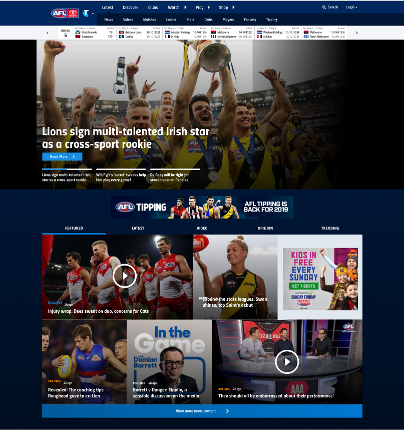

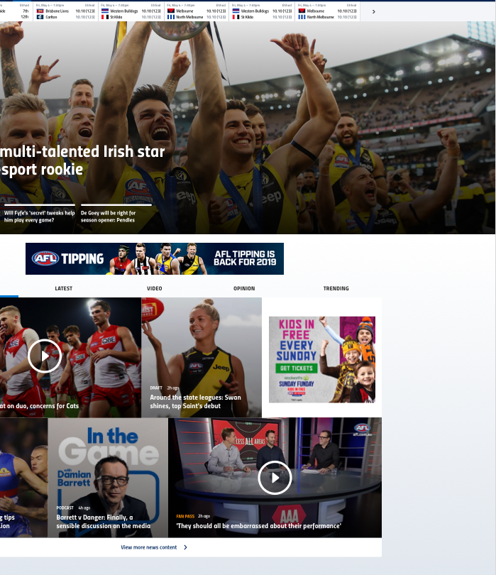
We used a whiteboard to quickly sketch concepts, followed with low-fidelity designs, then apply some UI and finally with the new styles and toolkit

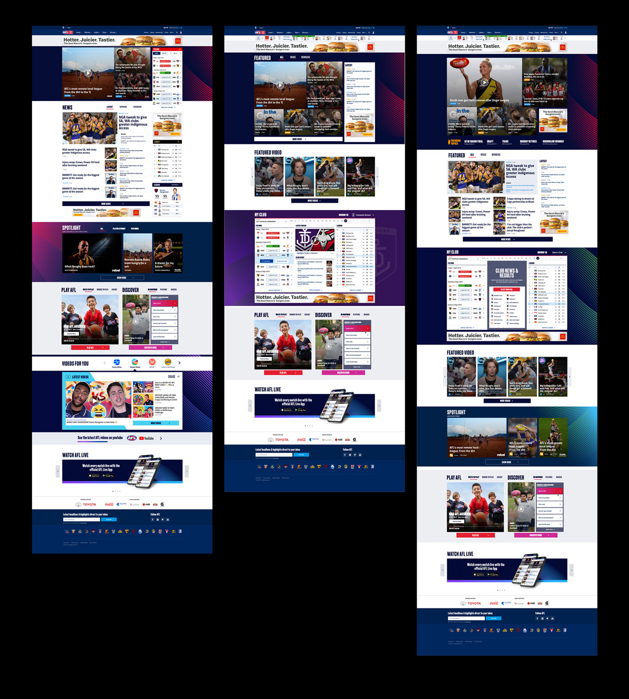
We came up with three layout options to user-test. The difference being more and less feature news, a new video module, ‘My Club’ section, and long-form content
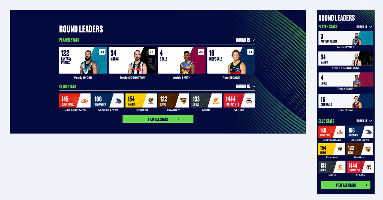
We came up with new modules that can be utilised across the site, including the homepage and news page.

